I have been trying to improve my graphic representation of my art for quite some time. I keep improving my tools, and it has helped but I am still frustrated. I know that all monitors are not all created equal and each person’s setting are all different and screens are LCD, LED, CRT, refresh rates, resolution, type of cables…? So much more.
I have great camera, laptop and other monitors. I have used the calibrating menu on each monitor, laptop. Checked on the 3 monitors I have, kids’ laptops, mac laptop, ipads…all differ. Can’t seem to get a happy medium across all or many of the monitors.
I thought a shortcut would work and since I have Carol Marine’s books, and have asked her if her art came out in the right colors on them, and compared her online book image with the book in my hand…got the online pic to look just like the book in my hand-I was golden. Maybe. But then I ordered an item from Cafe Press with my art on it Cafe Press . On my screen image looks like the art, what I received Cafe Press Tumbler with the art on it, it was darker and tinted yellow/red. That’s whan I said AAAARRGGG!! I have heard that Cafe Press does have good quality and color. It must be my set up.
All of this translates to my questions: what does everyone else see on their monitor when viewing my art?
Wouldn’t I have better sales if my images were (near) perfect?
I have not invested in $300 software. Is that my next step? I am about to purchase Datacolor Spyder4Express S4X100 Display Calibration Device for about $100. Is this what I need?
Thanks for the help guys! I was ranting to hubby and he said, can’t you ask your online friends/community for advice? I said, oh, yes I can!
From what I know (which tech-wise ISN’T MUCH), Apple/ Mac is the gold standard in monitors. My iPad fairly closely matches my Nikon display, so I pretty much rely on it for accurate color rendition. On my iPad, your images look pretty good–though of course I have no idea how well they match the originals.
So far, no buyers have complained about my online images not matching my originals. To get those images, I use an Epson 1660 Photo scanner I have had for a decade. Smaller pieces fit; I scan larger pieces in sections and piece them together in my (also old) Corel program. For color matching, the old scanner far exceeds anything I get with my digital camera. The scanner used to match my Dell CRT monitor perfectly, but that has darkened over time, and I have to adjust scans accordingly. I dread the day, fast approaching, when I have to replace all my equipment. For calibration, I have heard Spyder is the way to go.
That said, (fabulous) illustrator and former classmate Robert Hunt provides very thorough instructions on how to professionally photograph art to reproduction standards. Someday I will do it this way (maybe.) http://www.drawger.com/roberthunt/?article_id=14813
Thanks for posting this, Connie! Yes, I have a Mac desktop, and I can get my photos to look like my art, using my Canon camera and iPhoto editing program. But I notice the art looks differently on the iphone and iPad. I sent off some of my art to make postcards through Moo.com, and they too, turned out very yellow/red, nothing like the real thing. I would love to get prints done of my artwork, but I am floundering on that… wondering where to get them done that it will be an accurate representation of my art.
My buyers say that the paintings look so much better in real life…so, monitors behave so differently, it is hard to know what they are seeing. But I am happy they love the art when it arrives.
Shifts can happen when a file is converted from RGB to CMYK for printing and when a printer’s color profiles do not match your computer’s. For expensive printing, work with a printer who will provide a proof.
Hi Sunny, I can offer no help with the photography or tech questions but I thought I’d let you know about another cost effective option which I prefer because I don’t want to deal with all that stuff, I would rather be painting!
I have my art digitally scanned by a family owned business, RT Art in Orlando, FL. They scan your art, which captures all details, and color match for a charge of $10 square foot (12" x 12" =$10)…no minimum, no set up fees. They will provide a proof for your approval, but I skip that step because they’ve always got everything spot on for me. Distance doesn’t matter, I ship everything to them and they ship my orders back to me within 10-14 days normally. They give you the digital copy to keep and they retain one for future orders. The majority of images I have on Daily paintworks are their handiwork: http://www.dailypaintworks.com/artists/wendi-vann-johnson-5928/artwork Paper prints and canvas giclees are excellent quality and actually wholesale priced, a 16 x 20 is $7.50 or a couple bucks more for complete packaging, ready to sell. Here’s their contact info ( send them an email and they’ll send you a wholesale price list) RT Art (321) 209-5528 info@rt-art.com.
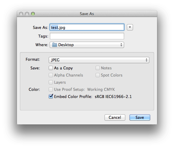
Hi Sunny, I downloaded a photo from your blog and opened it in photoshop. I noticed that doesn’t have a color profile embedded in it. This could be the cause of the color inaccuracy when you have your images printed.
The default color profile that digital cameras use is the sRGB profile and that’s what most photo labs/printers are expecting. When you adjust your photos make sure the option to embed the profile is checked.
The photo that was missing the profile was:
Midnight Snack (PB&J #31)
I did check a few and the options for color profiles were clicked and embedded. The problem I think is what I see on MY screen not being what is correct? Perhaps, the printing and file were right but not my monitor.
If that issue were fixed, I could be sure I am showing the proper image.
You’re welcome @savocado! They are wonderful people to deal with and very helpful! Forgot to mention this, RT Art will also drop ship your orders directly to your buyers for you.
The first two paintings that I checked were missing profiles so somewhere during the editing process the color profile is being discarded. I also noticed that you are using two versions of the sRGB profile:
sRGB IEC61966-2.1
sRGB IEC61966-2-1 black
In the screenshot below the two on the left with the red X’s are the ones missing the profiles, the painting of the avocado is correct, and the last one has the sRGB IEC61966-2-1 black profile.
This may not be the problem but if the file doesn’t contain a color profile then it’s not being color managed.
Anyways, Apple has a monitor calibration feature in the system preferences. I would use the expert mode, there’s a checkbox on the introduction screen. Apple has basic instructions on their site:
The problem in calibration is that nobody use the same calibration. So when you are working in graphic design, you try to have a calibration chain : every item use the same calibration profile, from monitors to final professionnal press printers.
Your problem here is that people will look at your painting via their monitor : mostly without calibration, or poor ones (real calibration is costly : real calibrable monitors are over 1000,00 $ and you need to buy the software/calibration tools too). So your paintings will look more green on a monitor and more yellow or red on another… and you can do nothing about that fact : the quality of your picture depends essentially upon the quality of the calibration process of the final viewer.
For the prints, it could be better because giclee or offset printers are calibrated. But, the color visual specter is very different from a monitor. Especially in offset printing, the color range is very poor : for example you cannot reproduce fresh oranges or greens : the adding process of CMYK is very limiting. In giclee prints, printers generally use a lot more pigments (around 10 colors) to have more color range and more subtlety in the rendered tones. Every person who can compare printed books with real paints will see a huge difference… if they can see the two at the same time. And I am sure that Carol Marine (you said that they colors are the same on printed books) will agree with me that the colors are different on every paint where she used very vivid colors (blue, orange, green).
The third bad fact is the limitation of your digital camera too… the dynamic color range is quite poor and you cannot have detailed blacks and detailes high keys in the same photo shoot : you have to make a choice (or your camera do it for you) and rely on Photoshop to have a more reliable picture (HDR could improve things a bit, but it’s quite complicated).
So, you can try your best, but, you can be pretty sure that your painting, who is shoot using a digital camera, then processed on your computer, and then finally displayed using a third way (monitor or print) have 100% chance to have been subject to color modifications…
This a very interesting topic. I love to paint but preparing images for display on the internet drives me CRAAAAZZZZYYY. As a retired scientist, Thierry’s statement that there is no solution to the problem is like waving a red cape in front of my nose. There must be a way to at least for those of us that care about these things to improve on the current situation short of buying everyone in the world a colorimeter. I would be partially satisfied if I could know that images going out my door were reasonably accurate. I would be even more satisfied if on leaving my paintworks gallery the images were accurate. I have never felt that images changed going through paintworks but I guess its possible.
Here are some potential ingredients to a solution. First the community of artists, compared to the general public, is keenly aware and highly trained in recognizing small differences in value, hue and saturation. i.e. we can tell when something is slightly off. We should be able to use this in some kind of cloud-based calibration of artists equipment. Second none of us has a lot of money to spare so a solution has to come down on the side of cheap rather than sophisticated.
I understand that the proper solution is to get a colorimeter for your monitor and an IT-8 target (colour chart). But everyone has to have these an that is not going to happen.
What if we all went down to Home Depot and picked up colour swatches from say Sherman Williams and scanned or photographed them. Then we could sample the RGB values from the middle of the swatch on our monitor. I wonder if differences between the paint company’s RGB values and ours would tell something about calibration. I do not know whether Sherwin Williams sells in Europe. Here is their chart of RGB values
The good thing is that when people first see your painting on their monitor, and they are impressed to such an extend that they decide to buy it, its more likely that they are pleasantly surprized with how it looks in real life, than that they are disappointed (though not guaranteed). At that point they get to see the brushwork better, the texture, the effect of light on the painting, etc. Things that are usually less obvious on a photograph of a painting.
It’s a similar effect you get when you go to a museum to see a certain exhibition, then buy the catalogue. The pictures in the book seem flat and unimpressive to us because we just saw the real paintings. Collectors that buy online have the advantage of not having seen it in real life yet.
I am continuing this thread, bcuz it seems others may benefit to the group wisdom as they have same issue.
I did buy the Spyder, and calibrated my monitor.
After photographing image, correcting in photoshop using spyder workspace, to have image printed- I would embed the spyder profile, yes? I am going to try the RT printer that @wvannjohnson suggested.
But embedding the profile has nothing to do with how the image is viewed online, correct? After correcting my monitor with spyder, all my art previously posted looks washed out and yellowy to me. I adjusted this one image to look right to me.
In fact you can have a really accurate reproduction of your art in YOUR monitor, but others will see it differrently on THEIR monitor.
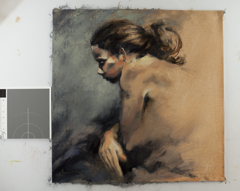
One of the best 1st thing to really improve your color accuracy is to buy a gray chart (quite inexpensive, around 15-20$ in France) and put it near your art work on the photo shoot (like in my sample). Then a simple click with Photoshop with the “pipette” (eyedropper?) on this gray chart will adjust the balance : Photoshop will remove any false coloration and retrieve the exact neutral color of the gray chart and then apply it to the whole picture : this is the very most important thing to do when planning to have accurate colors.
I can tell the difference in these two images when I compare them side by side. But I still love them both and am drawn to the painting regardless of the subtle variations in color. I’ll bet the original is fantastic!

 Forgot to mention this, RT Art will also drop ship your orders directly to your buyers for you.
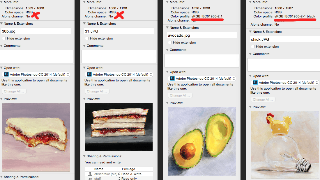
