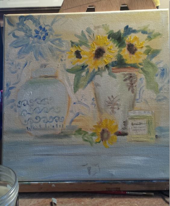
I am trying to paint this for a friend who adores blue and white pottery, and sunflowers…I will add sunflowers instead of the pink peonies.
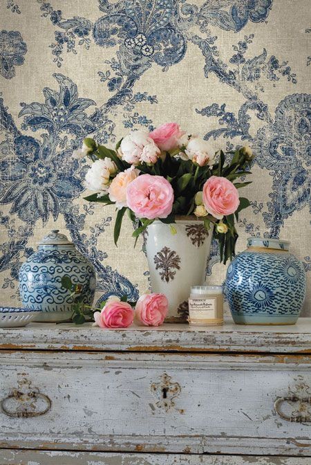
I am struggling with the background vs. the blue and white jar. Any suggestions on how to draw the jar more forward in my painting?
You can gray out the blue in the background a little bit. Blur out the background and put all of the concentration of color and contrast in the vase. Also slightly warm up the blue in the vase compared to the background blue. You don’t have to follow the photo exactly.
One great tip: If you put the photo on your computer and use the pick color tool, you can “see” better what color is actually there. It’s not just the blue that’s getting you here, it’s the white/cream color.
Agree with Sunny. Make the background more neutral and less detailed, then slightly warm up the vase. Also could darken the background, and create stronger light highlights on the vase.
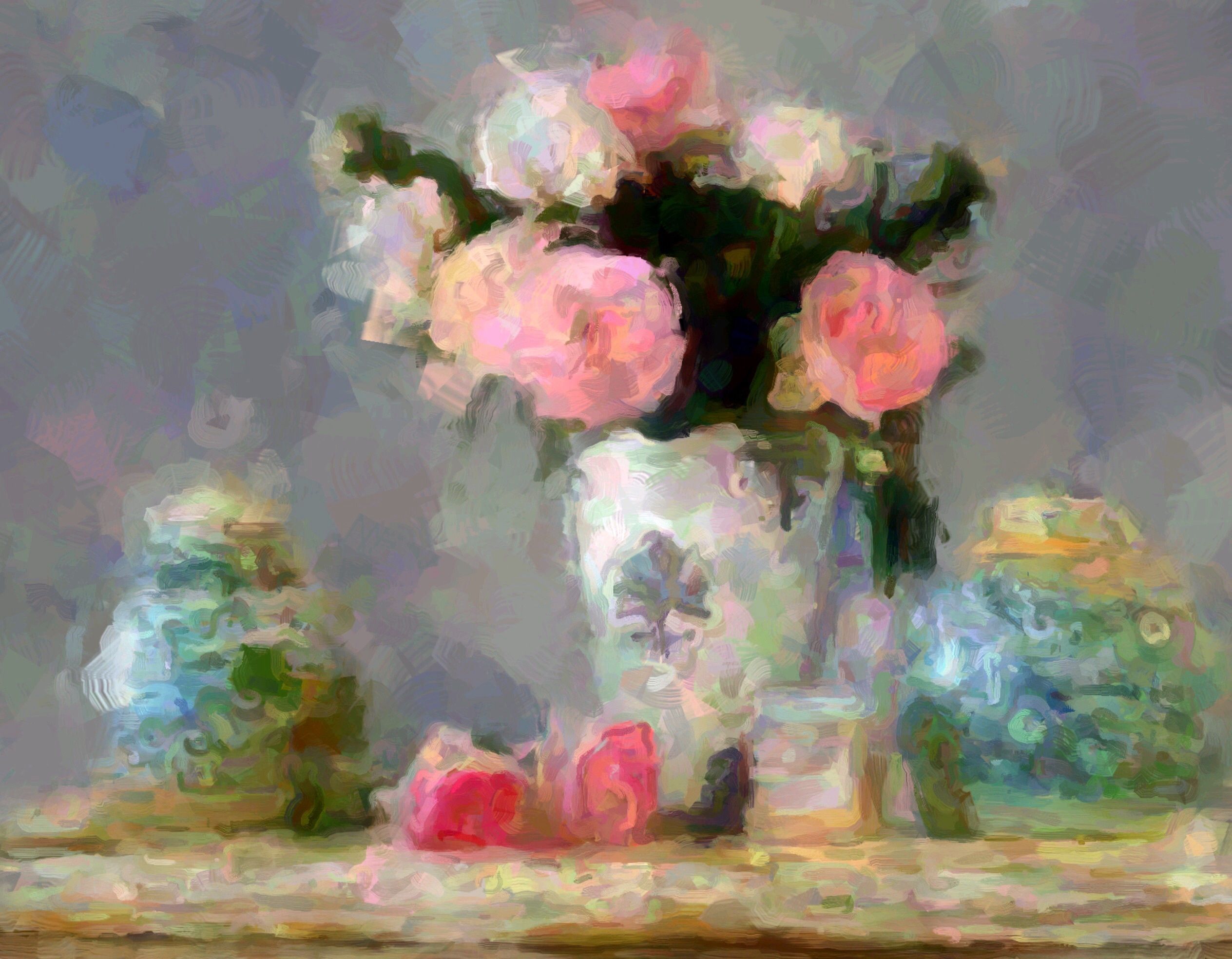
As the others have suggested, I would warm up and intensify the foreground objects and lose the background pattern entirely. I would also choose the most important area and give it the most contrast and detail and let other edges soften and blend with the background. Here is a quick digital manipulation that might give you a bit of the idea.
OMG Connie, I am shamed! LOL That is so beautiful I am in awe.
Your example really puts it in perspective…the original photo is way too detailed and the focus is
lost on me.
I love the greens in the vase…guess I wasn’t seeing them as well.
Hi Peggie, I think Sunny is referring to something you can do in Photoshop…which I have used in the past but i am not terribly good at. Still I need to try it!
I used Corel’s Paint Shop Pro (similar to Photoshop) to decrease contrast, increase saturation, and change color balance in selected areas, then an iPad ap called Paper Artist to create the blurry paint effect. You can do similar things in any number of programs and aps.