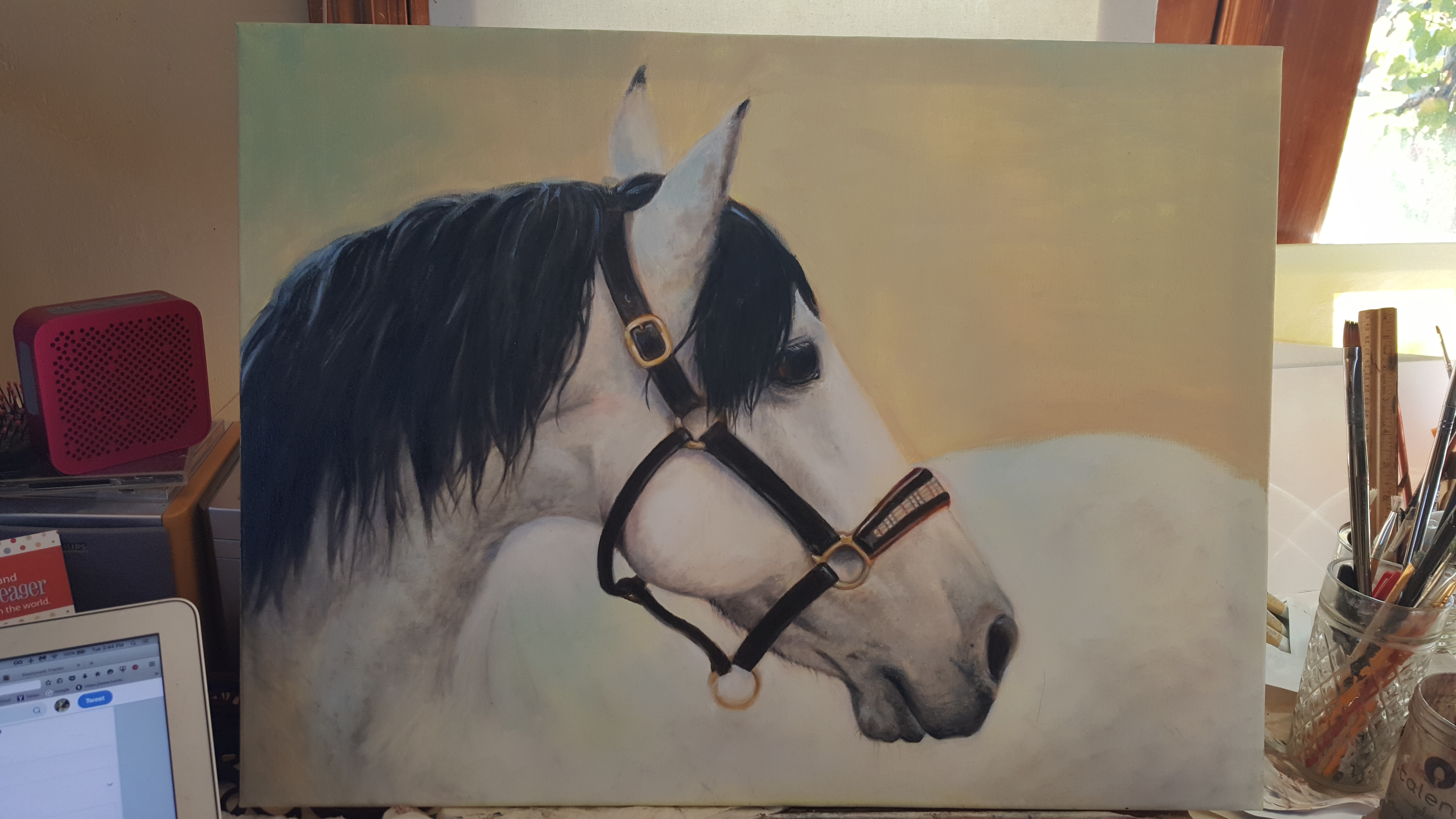
I am a newbie oil painter…I am wondering about what colors to use as a background …I am not sure of a rich brown/black or a lighter color as I have here. What would you do, and why?
Thanks in advance!
I am a newbie oil painter…I am wondering about what colors to use as a background …I am not sure of a rich brown/black or a lighter color as I have here. What would you do, and why?
Thanks in advance!
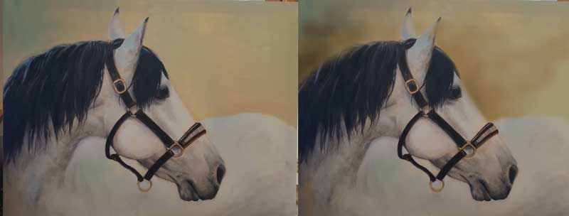
I always had trouble with backgrounds because I mostly threw them away and concentrated on the subject and was never happy with it. Recently I have used my abstract background technique with the subject and i am quite pleased. Isn’t finished yet…but:
No expert here, but what you have is beautiful, lovely painting! You can do a real background or just use color. I would soften the line between your two colors you have there and leave it at hat. But I prefer abstract backgrounds. I especially like the harmony in putting the colors of the subject into the background. Yours is soft and the horse is full of darks and contrast so I think you have a winner here. 
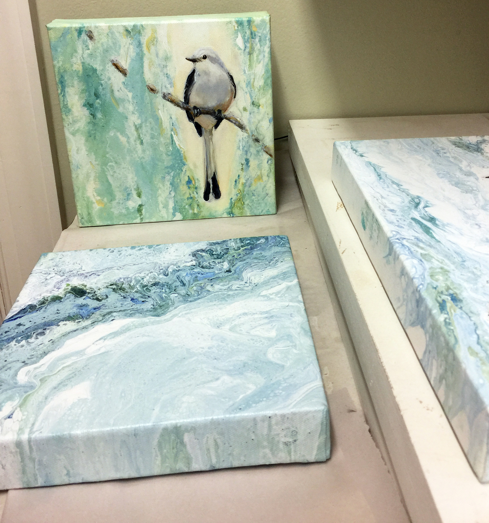
Thank you so much! I LOVE your work, your backgrounds are beautiful and the birdie is gorgeous!
Thank you thank you!!
Hi Brenda,
A possible way to approach backgrounds would be to first determine what you wanting to draw the most attention to in your painting. For instance lets assume your horses face is the “focal area”. There are a couple of different ways you could approach this.
Some artists use dark against light to highlight an area so you could darken the background against his light face and lighten it around the dark mane causing high contrast - but also lighten it around his hindquarters which will reduce contrast and not draw attention. I’ve seen a lot of portraits where the background is darker around the hair (assuming the sitter has dark hair) which softens those edges and reduces attention. That would be one approach. (Sunny kind of did that on her bird painting. Had she used the abstract background around the entire painting the bird would be lost. But the light against the hard edge of the dark wing attracts attention and the light against the head gives it a glow. Pretty nice.  )
)
Another way would be to give a “glow” around your subjects main focal area (face?). Described in David Leffels book as having the light burst so powerfully onto a subject that it caused the color to radiate into the atmosphere around it. Done by bleeding the subjects color into the background directly around the focal area kind of a foggy haze of color.
But as to your question of what color to use, I had an artist tell me to mix up all the colors on my palette that I used in the painting and use that. Hmmm. Maybe. If you did that you would likely get a cool grey and a very cold painting. If you went with a brown black as you mentioned, consider dulling it or de-saturating and warming it to give it depth and softening the color so the hindquarters have less contrast than the face.
Hope that helps or at least gives you some food for thought? :)
Brenda, I’m no expert either, but I’d say you are not far off with what you already have. You could always do a google search for ‘white horse’ images and see what comes up to give you an idea about what would work.
A quick google search came up with these with a similar color theme:
http://prydain.wikia.com/wiki/File:White-horse.jpeg
https://www.istockphoto.com/photo/white-arab-horse-gm186285450-27508050
I would maybe just darken the neutral tone near the horses back for a little more contrast otherwise I think you are there.
It’s a wonderful painting!! Beautiful.
Sunny, I absolutely love it!
Fantastic…I sure appreciate all the tips! Thank you for the awesome response!
Oh thank you so much for the pictures…I do like the colors in the pictures. Much appreciated!!
Wow, that’s great, thank you!!!
Gradate your background so that you can get the focal point to stand out. Like inn the samples that Lori Twiggs has shown, above.
Itry to give my backgrounds a little contrast with the subject. Darker/lighter, warmer/cooler, complementary colors.
It does not have to be extreme. Lori posted a good example of just enough contrast to set off the horse.