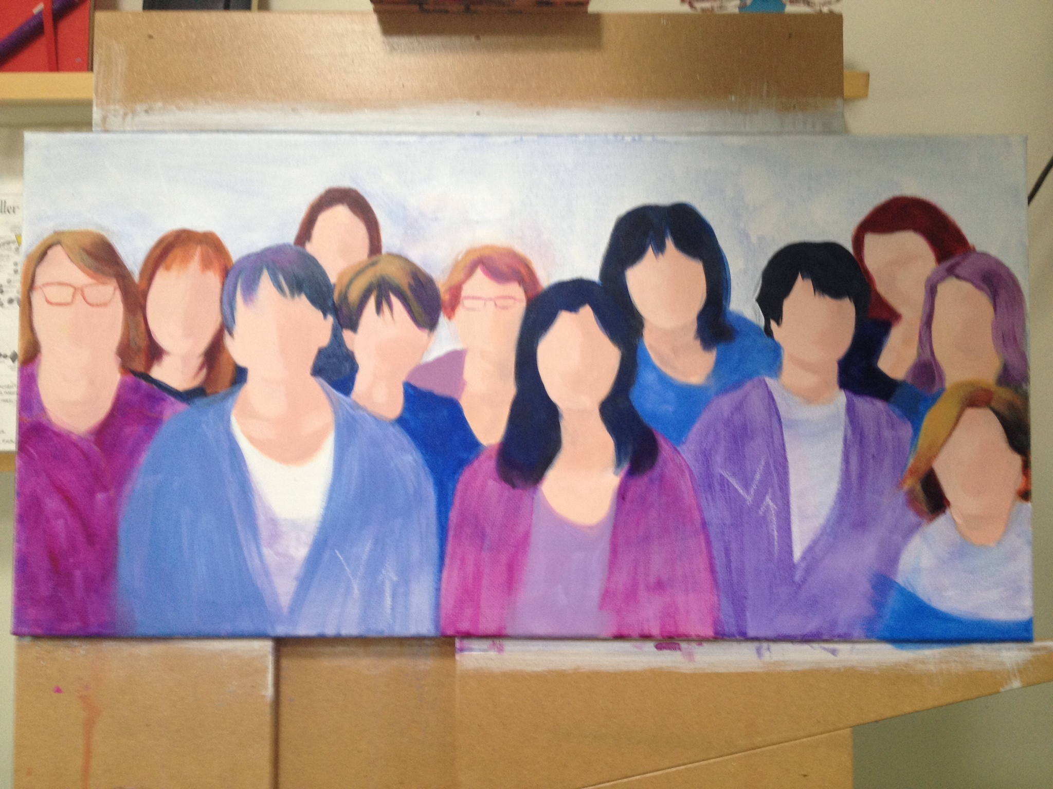
I paint figures in acrylics predominately & because I use a lot of titanium white in my flesh tones, these areas tend to be opaque. Because I paint the flesh areas first (i.e., “islands”) the darker tones are applied on top (i.e., hair). The latter colours tend to be transparent & look “cartoonish” beside the flesh tones.
Any strategies or suggestions on how to address this?
I don’t think that this has to do with acrylic painting but with values and edges. Is your darks too dark? If you are working from a photograph convert it to black and white and do the same with your picture and see if the values are the same. The other thing is to check if it is a cast shadow or a shadow caused by a turn. A cast shadow makes a stronger line and a turning shadow is very subtle. Think of a nose - the shadow cast by the nose will be more defined that the shadow of the nose itself as it turns in. Hope this makes sense because it does in my head.
Hi Suzy, Thanks for the reply. I totally understood your comments about the sharpness of a shadow & while I still have work to do before I master values & edges, I return to my original query. When I paint with oils, they seem to “cover” with fewer layers. When I apply my acrylic darks - no medium or dilution of any kind - their degree of transparency is very high. I can see brush marks - one must wait until the original layer is dry before subsquent layer can be applied, otherwise new strokes “pick up” previous ones.
The red-violets and blue-violets of the clothing are first layers - you can see the strokes very easily - when I add more layers I darken the value as well as increase the saturation. To keep the value light and make the layer more opaque, I always seem to have to add T. white, which makes the tones pastel - ie., the colour intensity is lessened. I’d like coverage, with intense colours.
Not sure if I am being clear in my question. I admit to being muddled myself
Which brand of acrylics are you using? The student grade acrylics have a lot of fillers in them and don’t cover very well. Another issue is that some pigments are more opaque than others, check the manufacturers color chart (typically available online) to figure out which colors are opaque. I hope this helps!
Thanks for your response; I’m using artist grade Golden, Liquidex and Altelier Chroma - and am aware of the different opacities of pigments - I guess I was wondering if anyone found a technique to lessen the number of glazes required to get deep saturation without having to mix in an opaque pigment.
I always go dark to light with acrylics, although recently I’ve tried experimenting with mid to dark for really dark backgrounds. I got caught out recently when I purchased a tube of titanium white which re-mixes with layers put on top of it (even after it dries), and has quite a high glaze quality to it when I use it with medium. It’s actually the opposite of what I wanted - which was to create white flowers over pale colours. It took me like 20 layers to get over the colour underneath. I don’t think I’ll buy it again. It also re-wets itself on the palette, if it comes into contact with new paint I am mixing, which I didn’t know it would do. All my other acrylics dry hard on the palette and do not ‘come back’. It pours out of the tube just like my other acrylics.
It probably has a purpose, just not sure what that would be! I have only been painting with acrylics for 2 years.
I’m wondering what surface you are painting on? When I use acrylics on panel, I think I get better coverage than when I use them on canvas.
I hope you find the solution you are looking for! I was going to suggest mixing in an opaque pigment of the same hue, until I saw in the comment section that you are looking for a technique that doesn’t involve using an opaque pigment. But that’s what I find helps me…
I must have miscommunicated - as I would like to use opaque pigment - but am I wrong: I though hues were created with certain pigments, some of which are opaque others are not.

 However, I’ll continue to experiment. Thanks for the response.